Raise & Exit – Visual Identity for Podcast
Brief
I created a bold, modern visual identity for Raise & Exit, Avasta’s new podcast . The design system brings together direction, transition, and energy through graphic elements like arrows and clean typography. The assets were tailored for multiple digital platforms while keeping a strong and coherent identity.
Final Logo
Main podcast logo. A dynamic composition that communicates movement, clarity, and purpose with a strong visual impact.
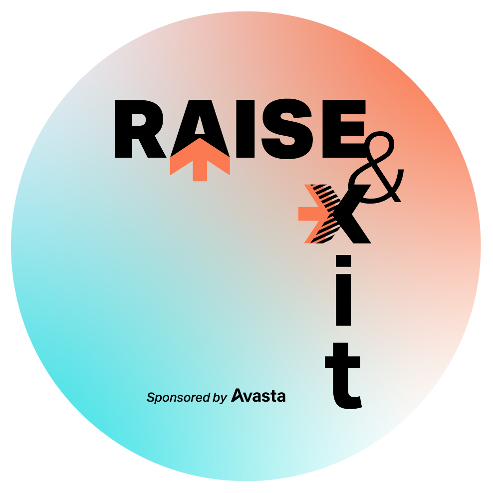
Circular podcast logo.
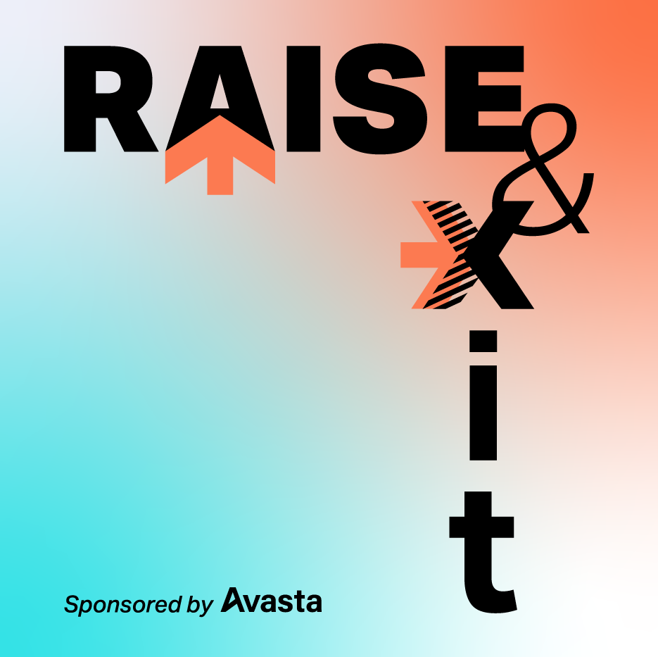
Square podcast logo.
Social Media Banners
Banner variations optimized for LinkedIn and YouTube — designed to be legible and impactful while keeping visual harmony across channels.
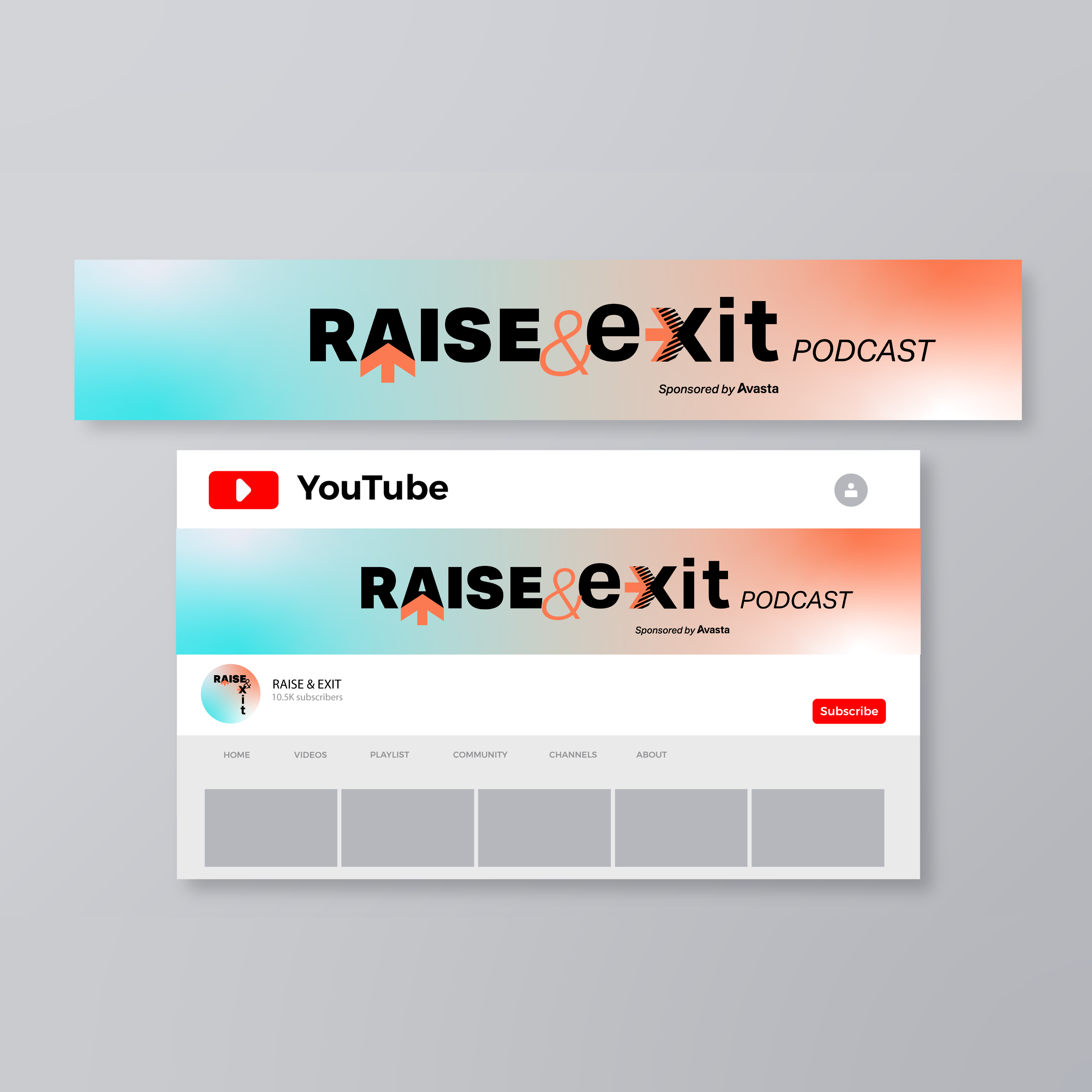
Youtube banner and Mockup
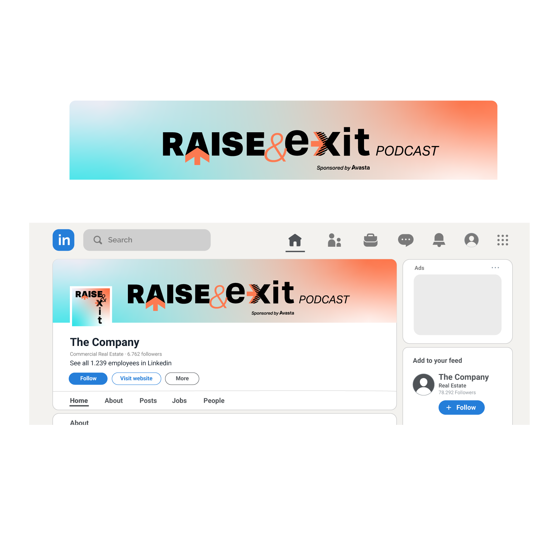
Linkedin Mockup
Email Template
Responsive email template designed in Figma for Raise & Exit. Includes desktop and mobile versions to ensure clear layout and consistent branding across devices.
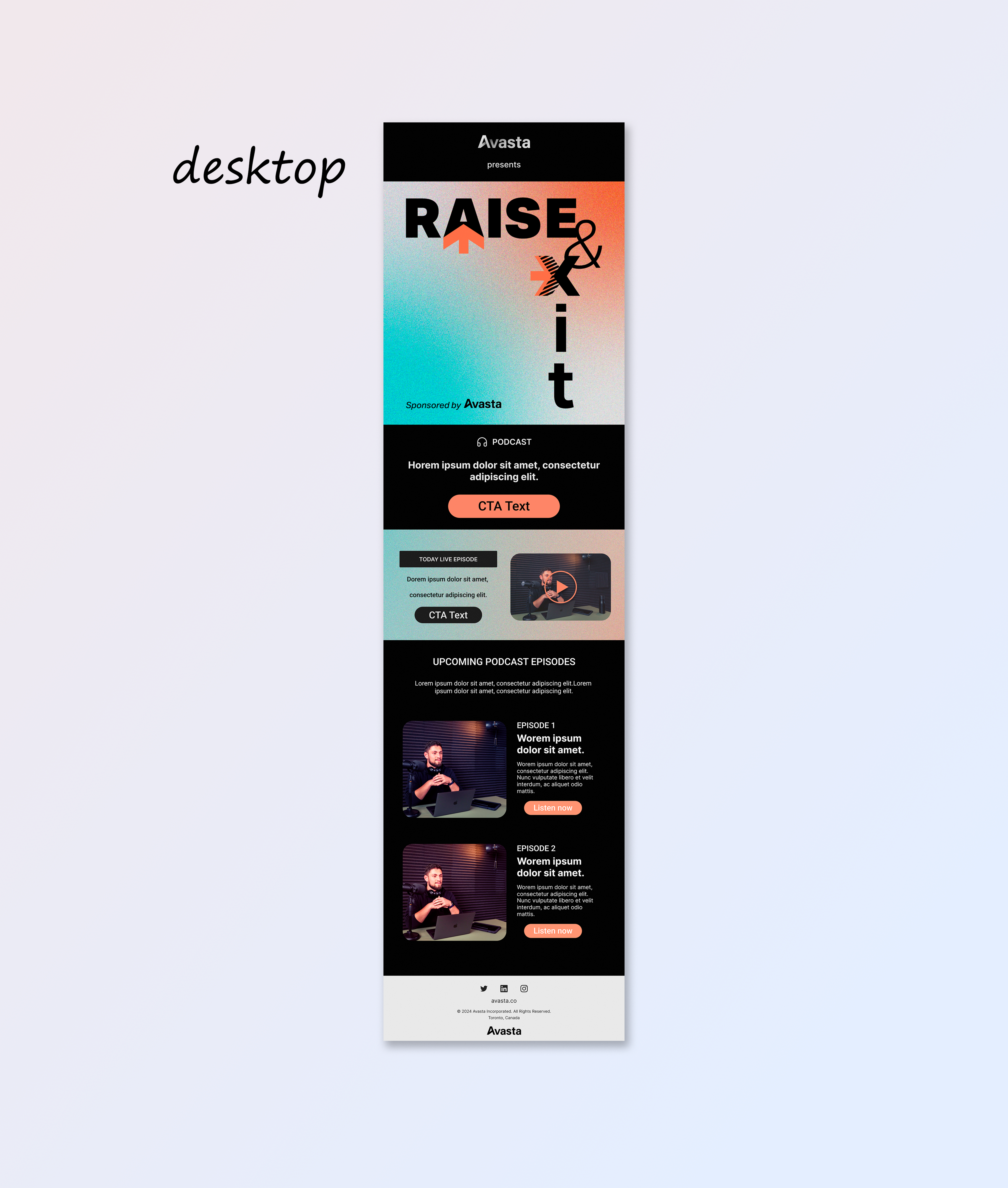
Email layout preview for desktop— with placeholder content and adaptable structure.
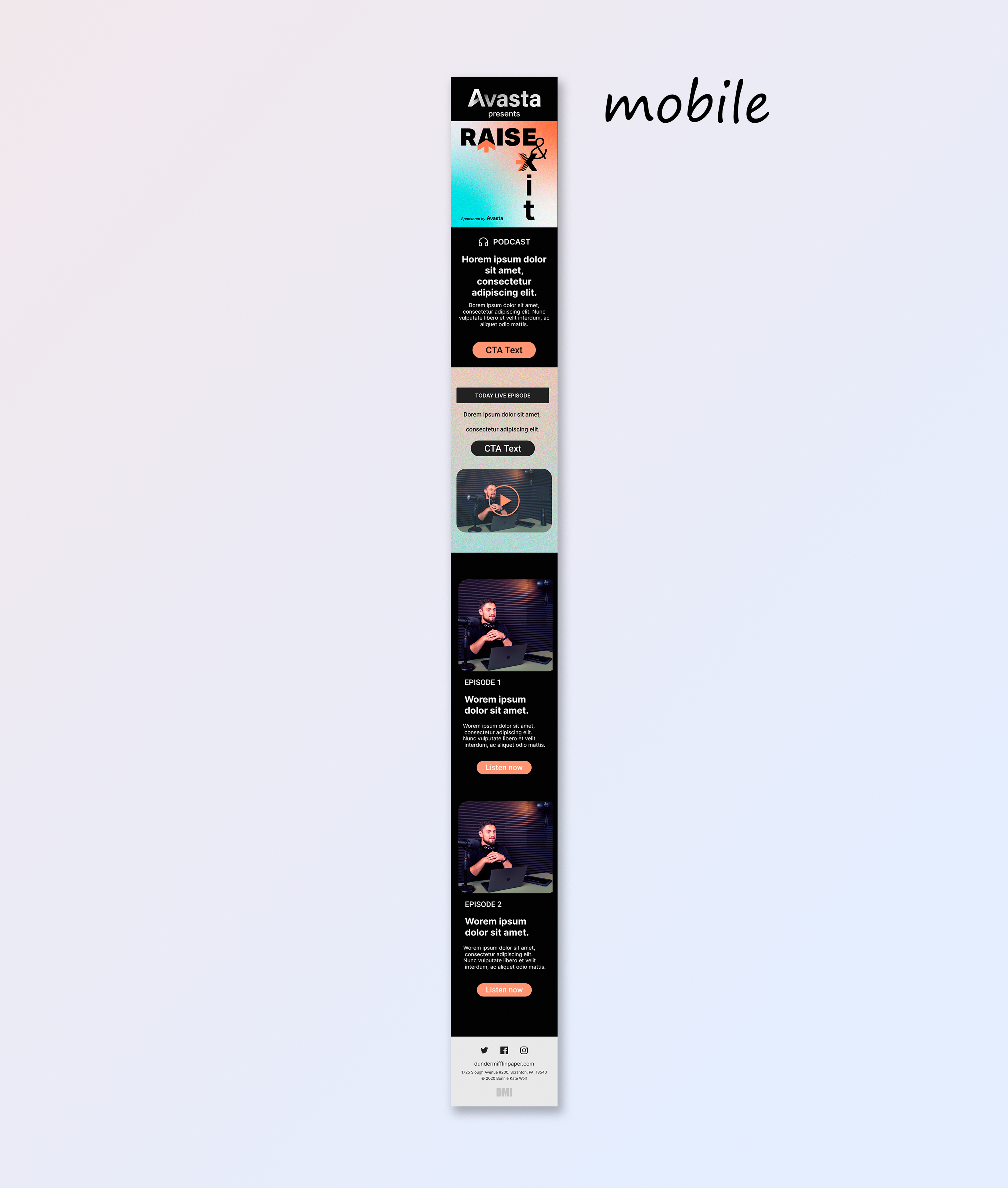
Email layout preview for mobile — with placeholder content and adaptable structure.
Visual System Overview
- Typeface: Aktiv Grotesk
- Colors: From Avasta’s brand toolkit
- Visuals: Arrows, gradients, bold contrast — all used to suggest action, momentum, and direction.
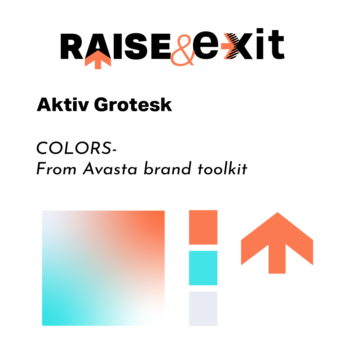
Visual System Overview
Inspiration & Visual Research
The concept of “exit” was explored through wayfinding systems, directional icons, and signage-inspired graphics. This research informed the shape and feel of the final visuals.
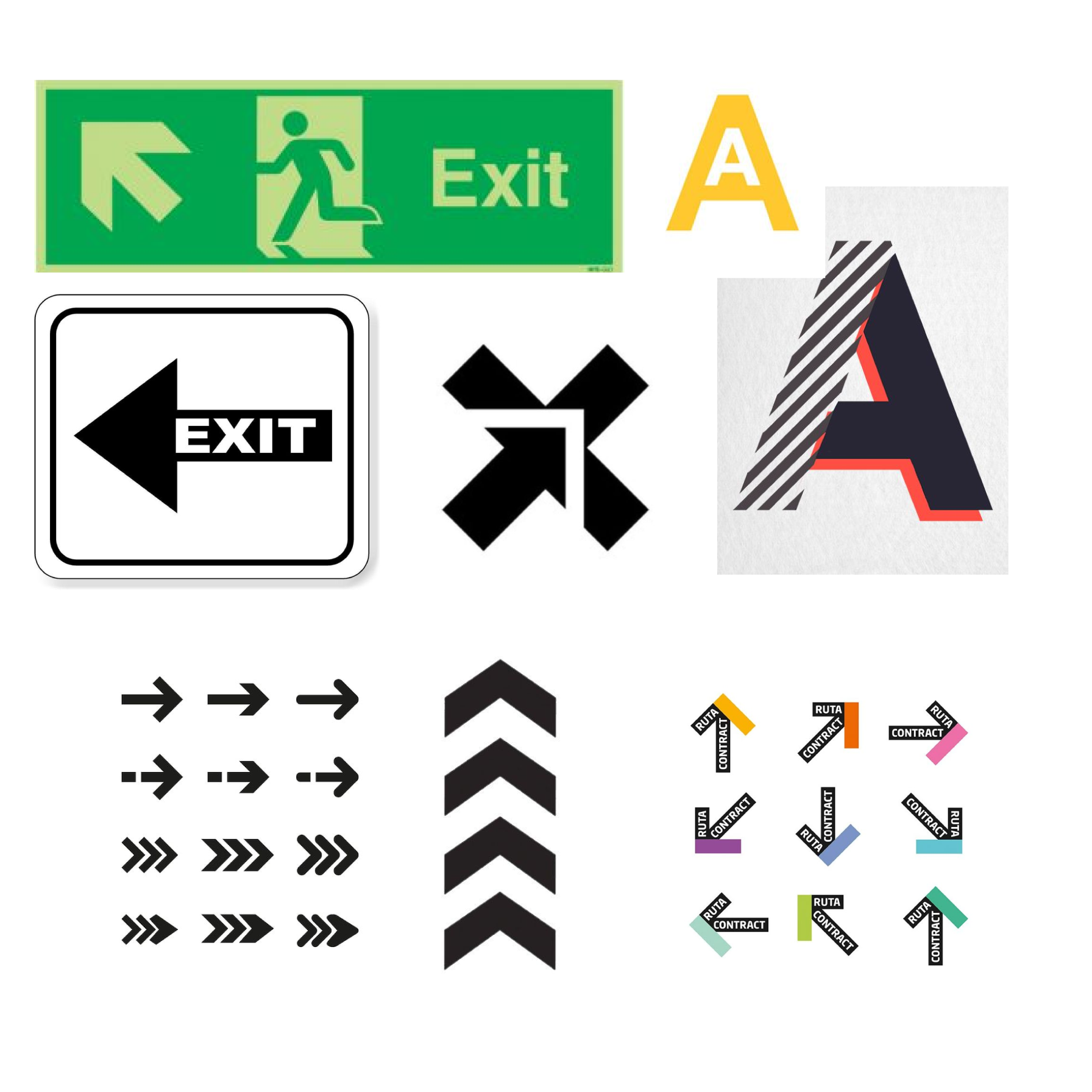
Inspirational Moodboard
Logo Exploration Variants
Exploration of color schemes, letter arrangements, and directional elements before landing on the final logo.
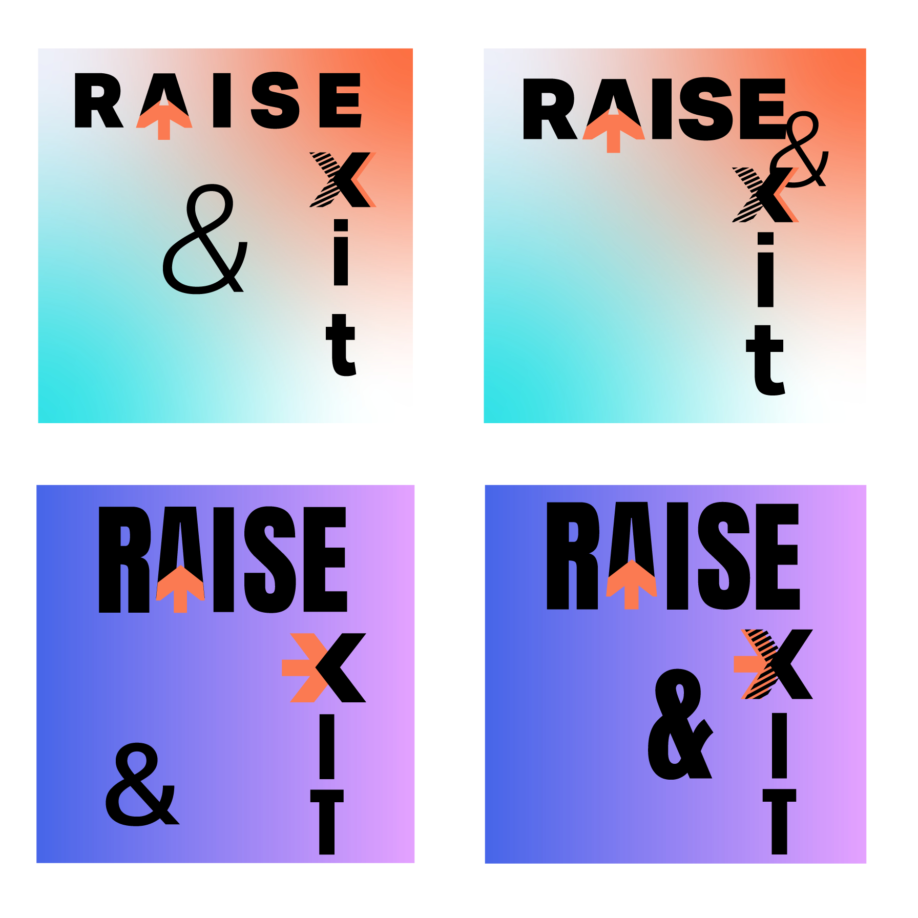
Logo variations
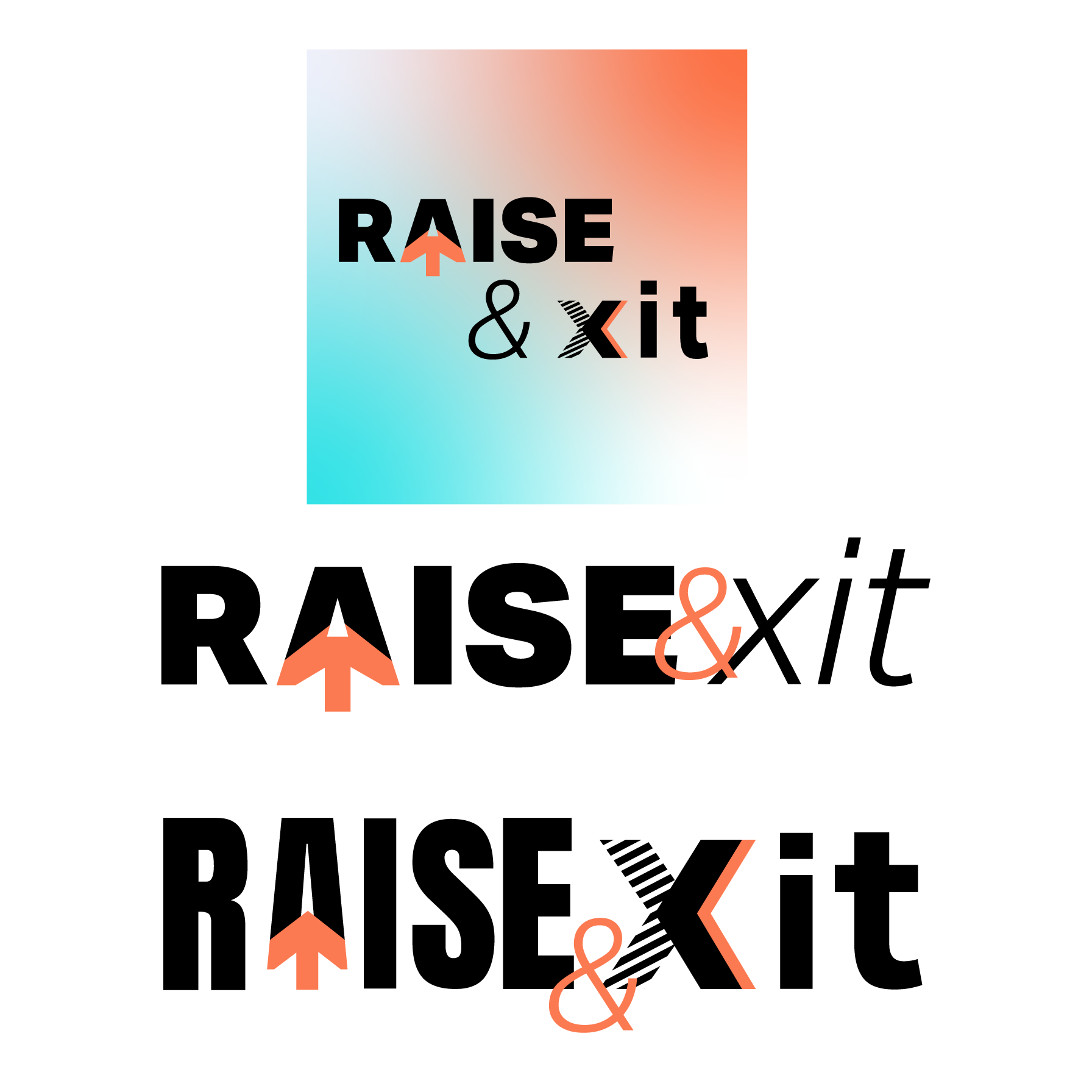
Logo variations and layouts