SOI Design – Contemporary Architecture Studio
Brief
Contemporary Architecture Studio
SOI Design needed a website that aligned with its architectural approach: clean,
contemporary, and visually grounded. The site had to showcase a portfolio of single-family homes with
clarity and precision, and express the studio's identity consistently across all devices and touchpoints.
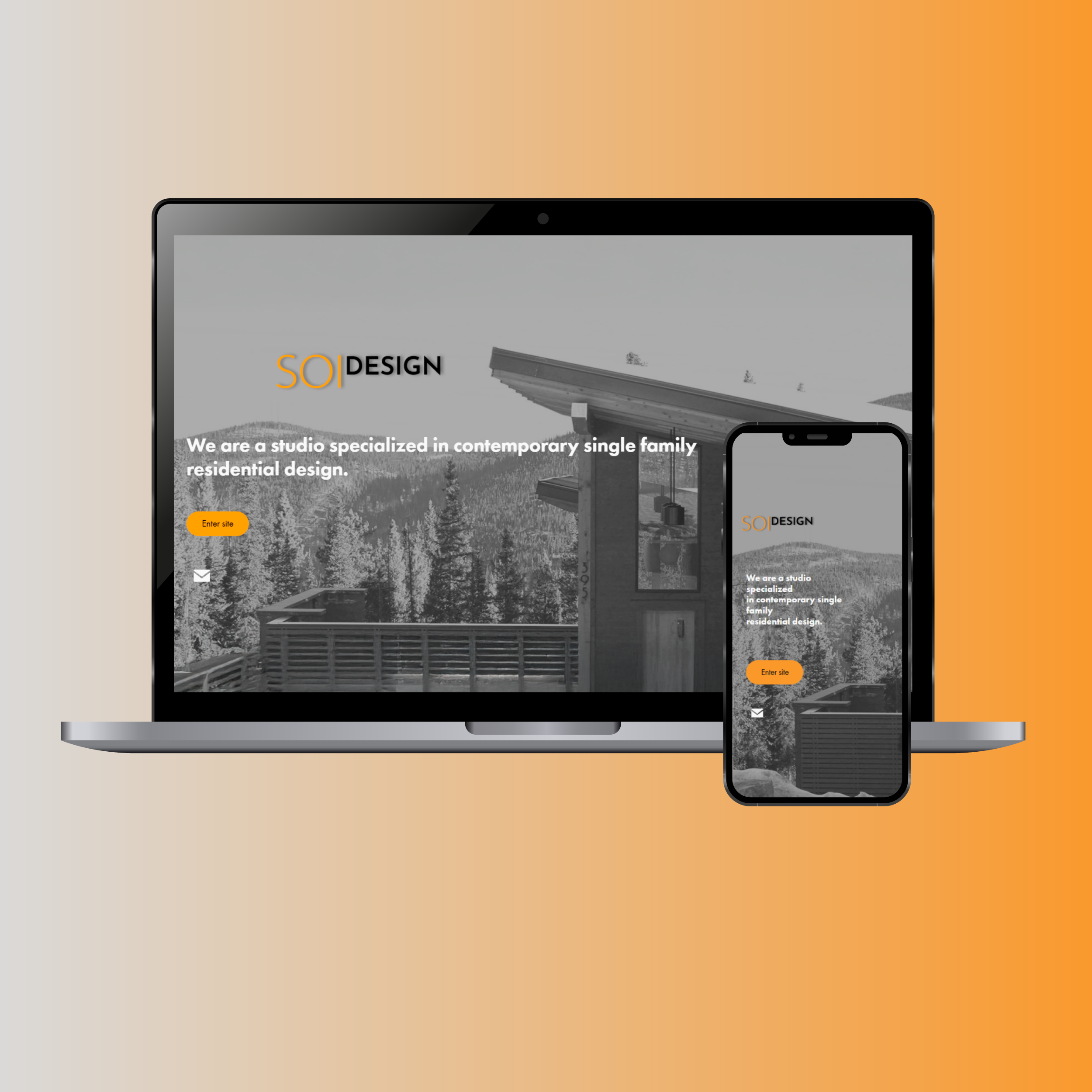
Responsive homepage mockup
The Challenge
The goal was to design a new portfolio website for SOI Design—an architectural studio with a refined and contemporary vision—that could showcase its projects clearly and effectively, without overwhelming the viewer. The main challenge was to maintain a minimal, content-focused experience while still infusing it with personality and a strong sense of place.
The Process
- Structured the site around four key sections: Home, About, Projects, and Contact.
- Developed a clean layout system and typographic hierarchy that supports readability and visual flow.
- Designed the branding assets, including logo variations and the color palette, aligning with the studio’s modern, geometric aesthetic.
- Focused on responsive design, ensuring a seamless experience from desktop to mobile.
- Highlighted project imagery and structured it into immersive galleries and individual project pages, with brief descriptions and visual documentation.
Gallery
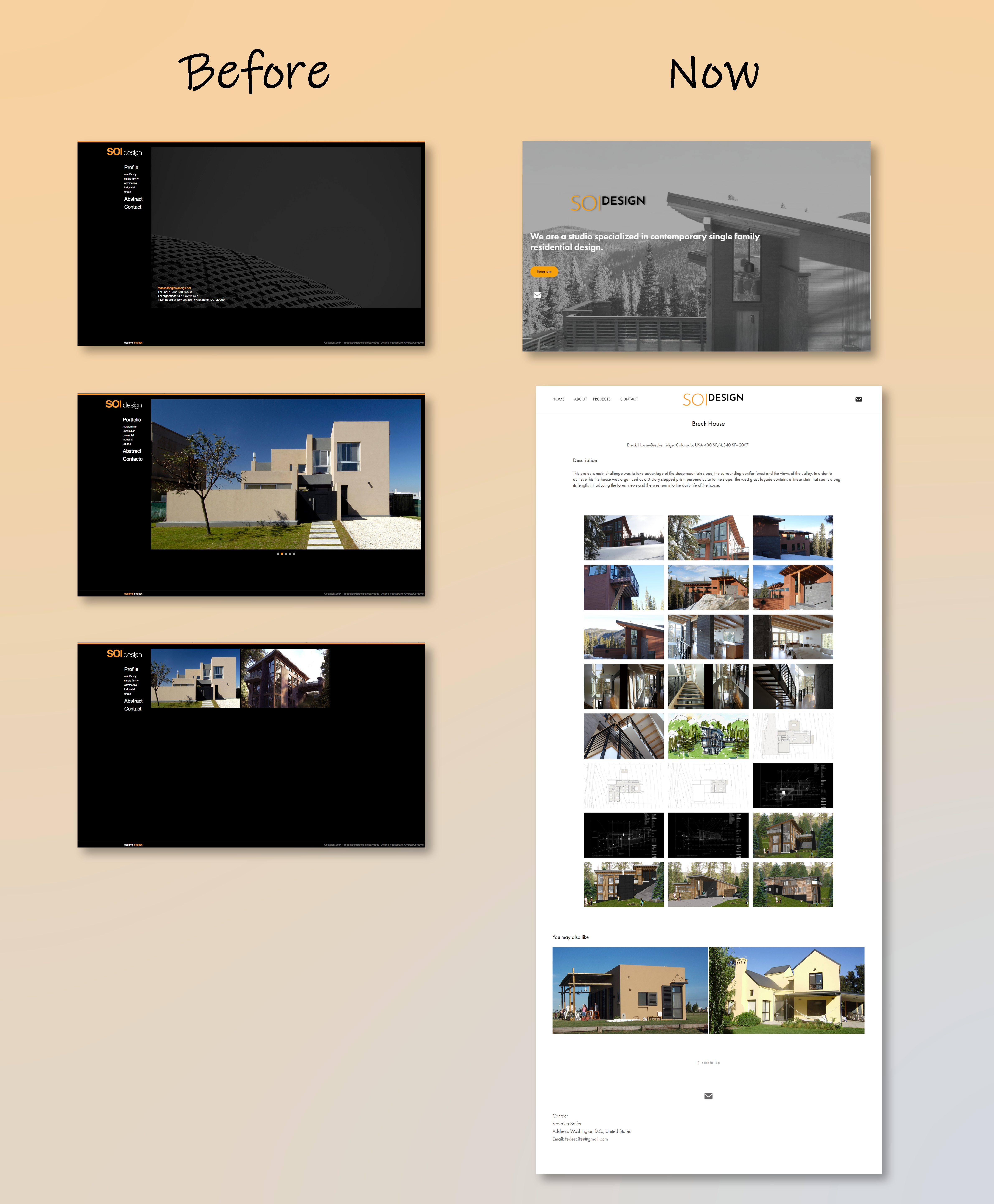
Website redesign – Before and Now comparison illustrating improved structure, readability, and visual identity.
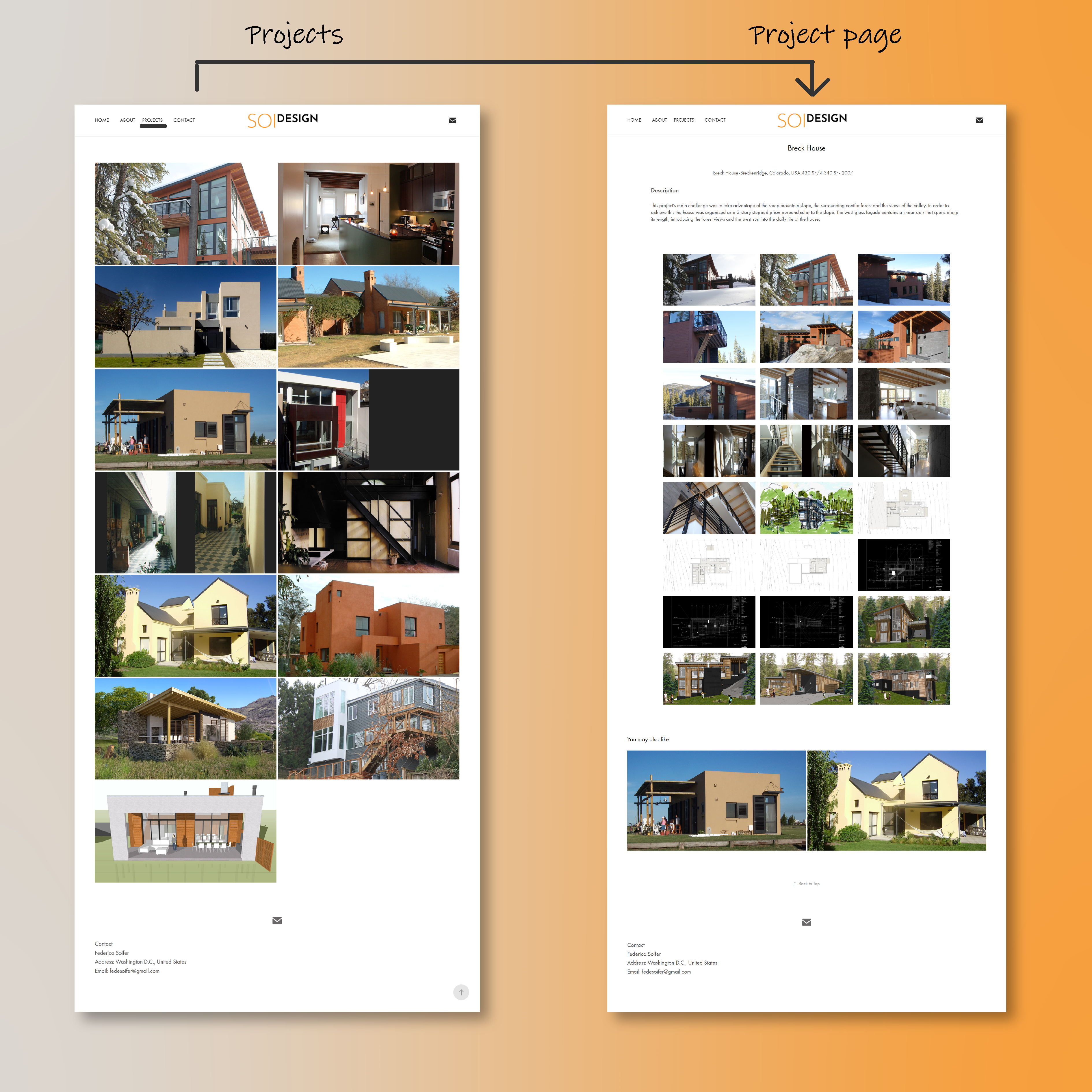
Project architecture on desktop – From grid-based gallery to individual project view with detailed documentation.
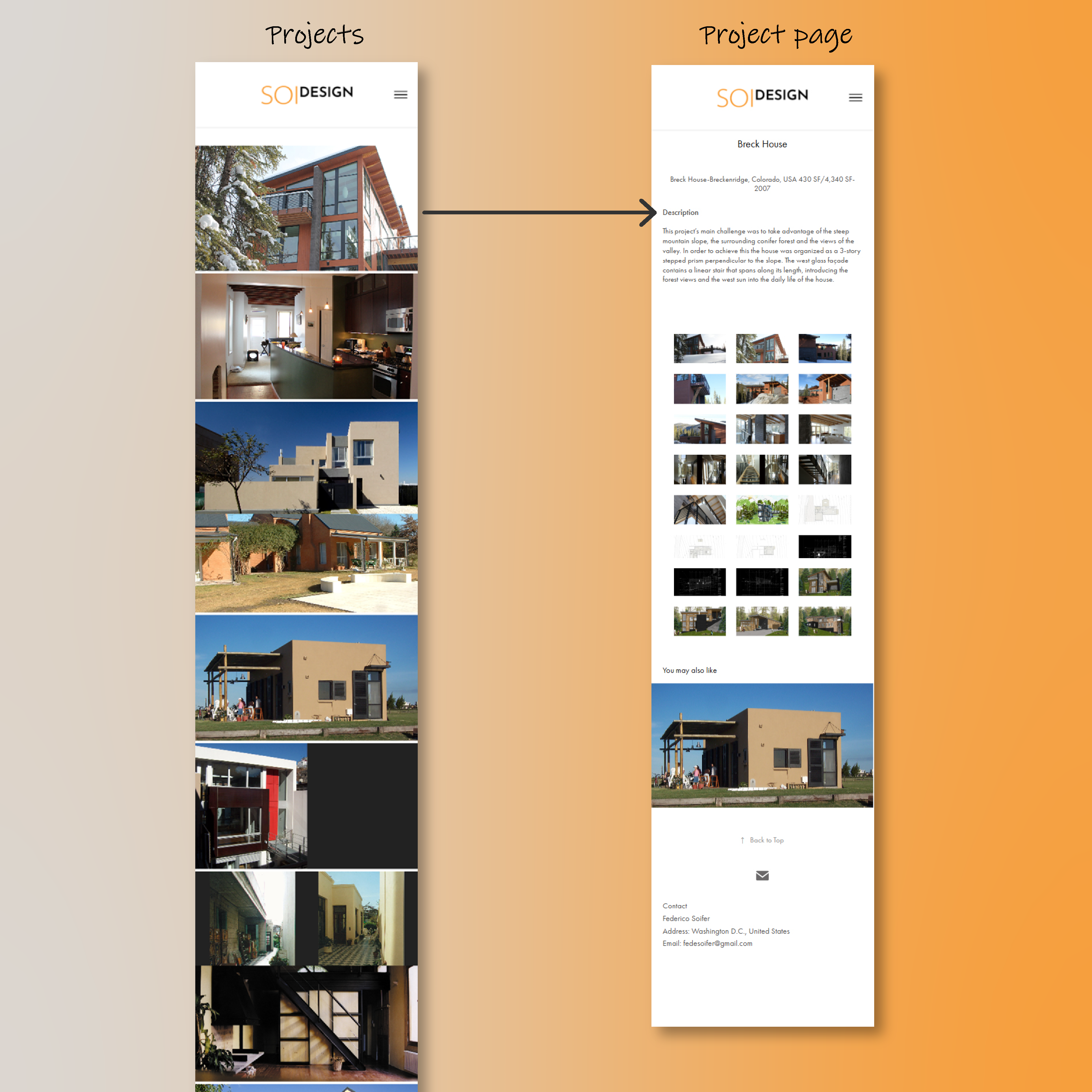
Mobile-first approach – Optimized content flow and visual hierarchy for small screens.
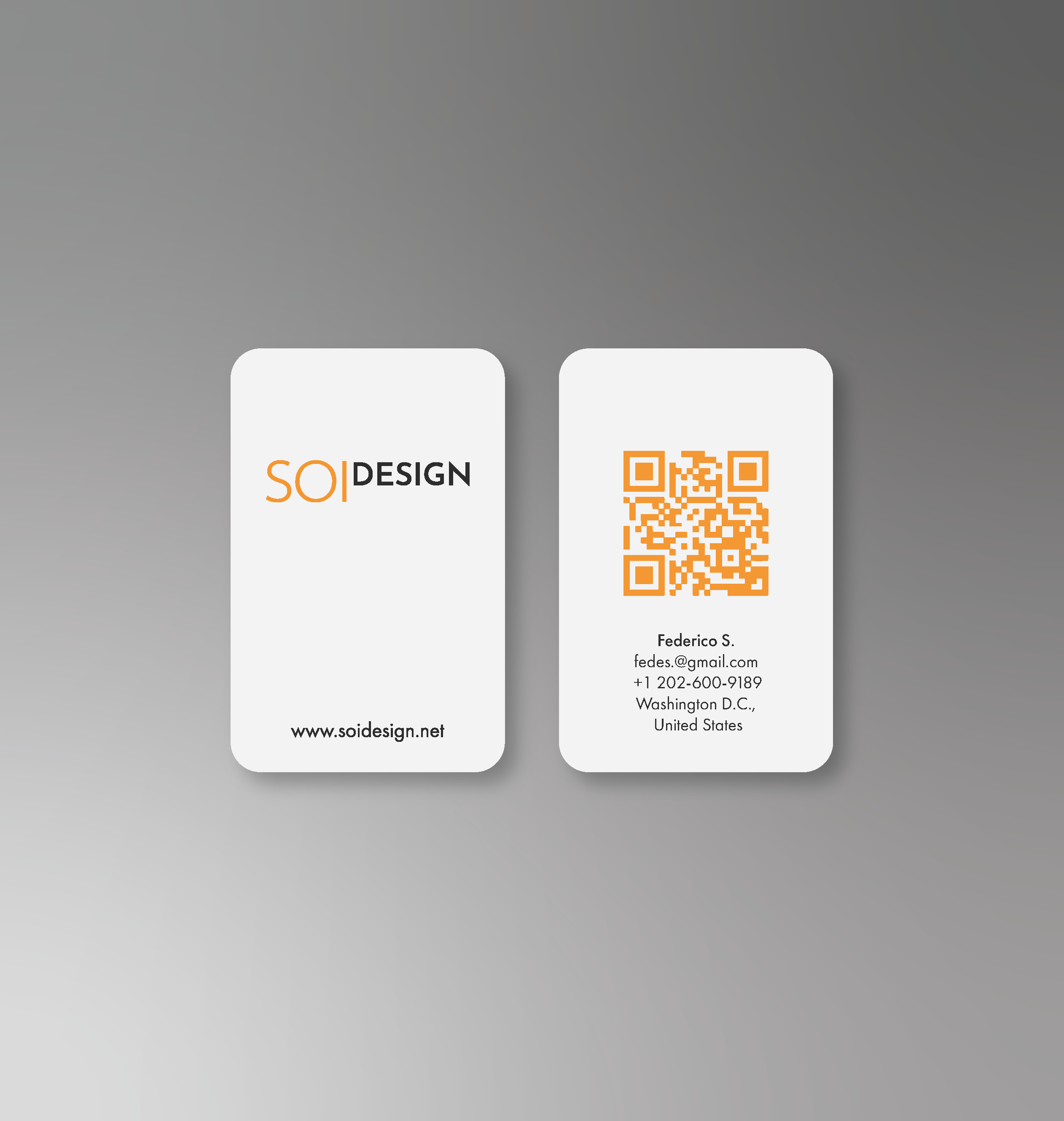
Brand application – Business card design extending the studio's minimalist identity with a QR code for quick access.
Visual Direction
The visual identity took cues from architectural elements: proportion, rhythm, balance, and structure.
Logo variations.
Final Logos, color palette, button styles.
The Solution
I designed a responsive website that brings the studio’s portfolio to life while maintaining a minimalist aesthetic. The layout highlights images and project content without distraction.
- Reinforce the brandwith a custom logotype system with versatile variations.
- A refined color palette anchored in burnt orange and neutrals
- A clear visual hierarchy using modern sans-serif typography.
These elements were consistently applied across the interface, from desktop to mobile views, ensuring a cohesive and elegant user experience.
Outcomes & Learnings
What were the results of your project? Did it achieve its goals? What did you learn from the process? What would you do differently next time?